.png)


Posta Studio is currently contributing 1% of its revenue
to fund carbon removal.

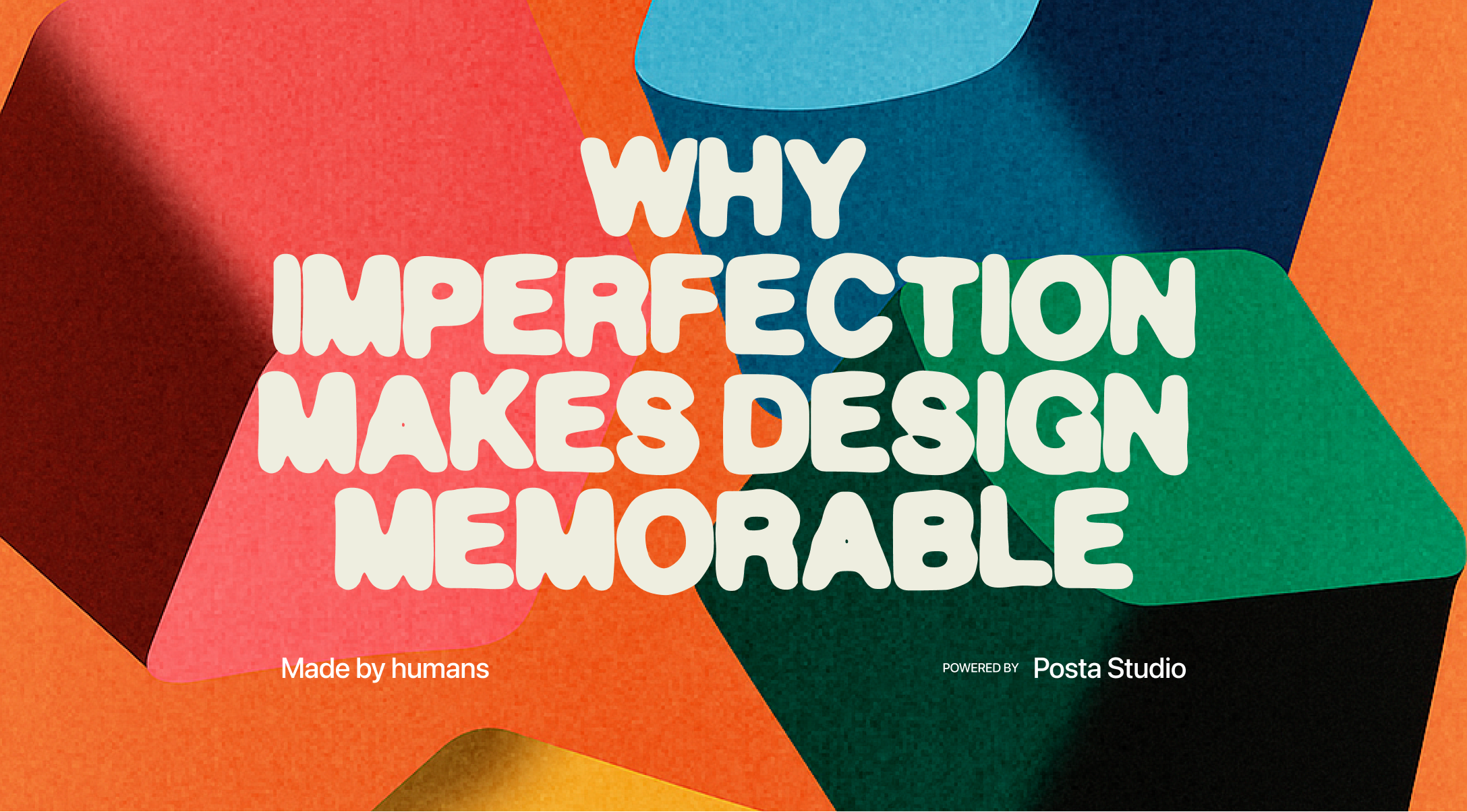
In today’s design culture, everything is moving toward polish, speed, and predictability. We scroll through endless feeds of flawless grids and AI-generated visuals, and after a while, it all starts to blur. Smooth, yes. Perfect, maybe. But memorable? Rarely. What sticks in our minds aren’t the clean pixels; it’s the quirks, the accidents, the traces of humanity that remind us someone real was behind the work.
When we look back at the projects we love the most, ours and others, they’re rarely the ones that were technically flawless. They’re the ones that carried a bit of risk, a weird choice, or something that wasn’t part of the “safe” playbook. It might be a hand-drawn line that didn’t line up perfectly or a logo that looks more like a doodle than a polished vector. But that’s what people remember: the feeling, not the alignment.
And we see this everywhere outside design, too. People are buying vinyl, shooting film, going back to handwritten notes, not because those things are easier, but because they feel alive. In design, imperfection is proof that a person cared enough to leave a trace of themselves behind.
When we start client work, there’s always a moment when we ask, “Okay, but what’s ours in this?” It doesn’t mean ignoring the brief, but it does mean finding a way to bring a little of ourselves into the process.
Sometimes it’s a small thing, a texture we’ve been experimenting with, a color palette we love. Other times, it’s a bigger break, where we step away from what’s expected and ask, if this project were mine, how would I design it? Strangely, those are the projects where the client usually lights up. They see authenticity. They see us caring.
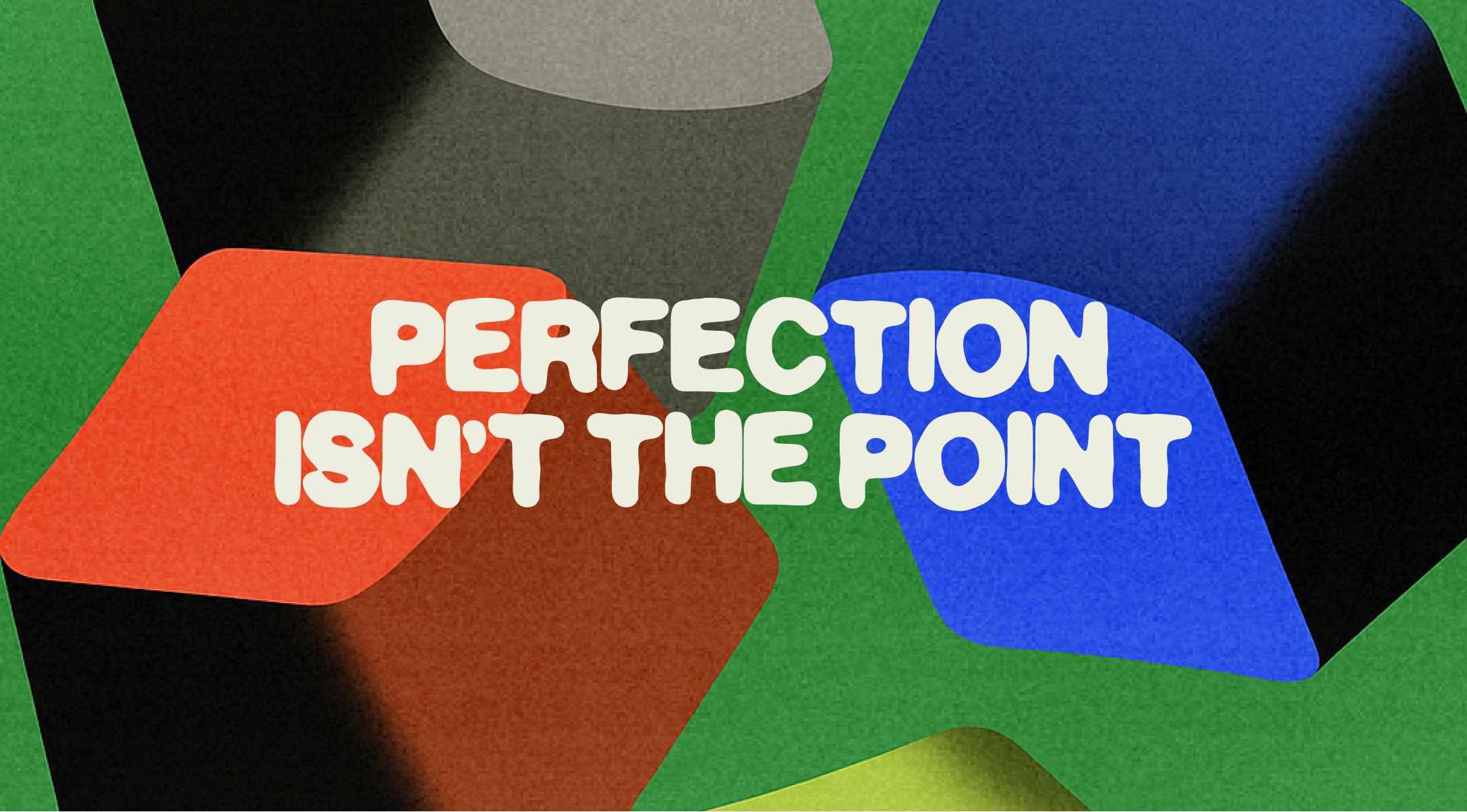
Perfection doesn’t create connection. Personality does.
The instinct as designers is always to refine. Sharpen the edges, clean the lines, make it consistent. But we’ve lost some of our favorite ideas that way, because the raw, imperfect sketch was where the energy was.
We remember one brand exploration where the “draft” was supposed to be temporary. A crooked butterfly sketch, uneven lines, not meant to last. The client loved it instantly. Not because it was polished, but because it felt like them. We ended up rebuilding the whole identity around that raw energy.
Imperfection doesn’t always mean careless; it can mean alive.
Digital tools are powerful, but they can make everything flat if that’s all you use. Some of our most memorable projects started with something physical: a wrinkled ticket stub, a Polaroid photo, a page from an old notebook. Scanned, layered, reimagined, they became design elements with history embedded in them.
When you ground a digital project in real-world fragments, you bring texture and soul. People notice, even subconsciously. It’s not just a layout anymore; it’s a memory.
We’re both guilty of killing ideas too soon because they looked “ugly.” But ugly is necessary. Ugly is the crack in the wall where something new can grow.
Our early drafts rarely look shareable, but when we keep them around, we notice how often a small detail, a strange shape, a quick sketch, ends up informing the final. The first version doesn’t need to be perfect; it just needs to exist.
Think of it like stretching before you run. Nobody claps for your stretches, but you can’t run without them.

The pressure to make everything Instagram-worthy is suffocating. Should we film this? Should we share the process? But some of our best ideas have come from un-aesthetic moments: sitting in pajamas, crumbs on the desk, working while the dog barked in the background.
Those moments wouldn’t go viral, but they gave us freedom. And freedom is where creativity thrives.
Play for yourself. Forget the audience, at least for a while.
When you see design as a list of problems to solve, it becomes mechanical. But when you see it as a story, it becomes memorable. Every typeface, every color, every visual can carry a fragment of narrative.
One of our projects started from a memory of late-night conversations, plastic chairs, soft light, endless questions. The design ended up referencing that memory in subtle ways, not literally but atmospherically. People who experienced it didn’t just see a logo; they felt the vibe of those conversations.
Design that tells a story lingers longer.
Not everything has to become a deliverable. Some of the most refreshing moments in our practice came from experiments that went nowhere, mockups for imaginary brands, fake posters, playful packaging ideas. They weren’t “productive,” but they kept our creative muscles alive.
Sometimes the work that starts as a joke or side project ends up shaping real client work later. Play is never wasted.
Trends are tempting because they give quick approval. But the work that lasts, the kind people still remember years later, comes from taste. Your own taste, shaped by your influences, your culture, your curiosities.
We’ve redesigned our personal branding multiple times, and each version tells a story of where we were at that moment. Our taste kept evolving. And that’s good. Because evolution means growth.
Trends fade, but taste is what turns into a voice.
Imperfection in design is the pause in the music, the scratch on the vinyl, the uneven brushstroke that proves someone was there.
We don’t remember the flawless projects; we remember the ones that made us feel something. And feelings live in the imperfect details.
So next time you’re pushing pixels, pause. Leave room for the crooked line, the messy draft, the playful experiment. That’s not weakness. That’s the part people will carry with them long after the scroll ends.


Book a demo and see if this is the best solution for your startup!
Hola, se habla español


