.png)


Posta Studio is currently contributing 1% of its revenue
to fund carbon removal.

When we started in design, “taste” sounded like a mystery trait — you either had it or you didn’t. The more we designed (and bombed a few drafts), the clearer it became: taste isn’t magic. It’s a muscle. You train it by looking on purpose, collecting like a librarian, and editing like a chef. You sharpen it by turning “I like it” into “here’s why this choice serves the goal.”
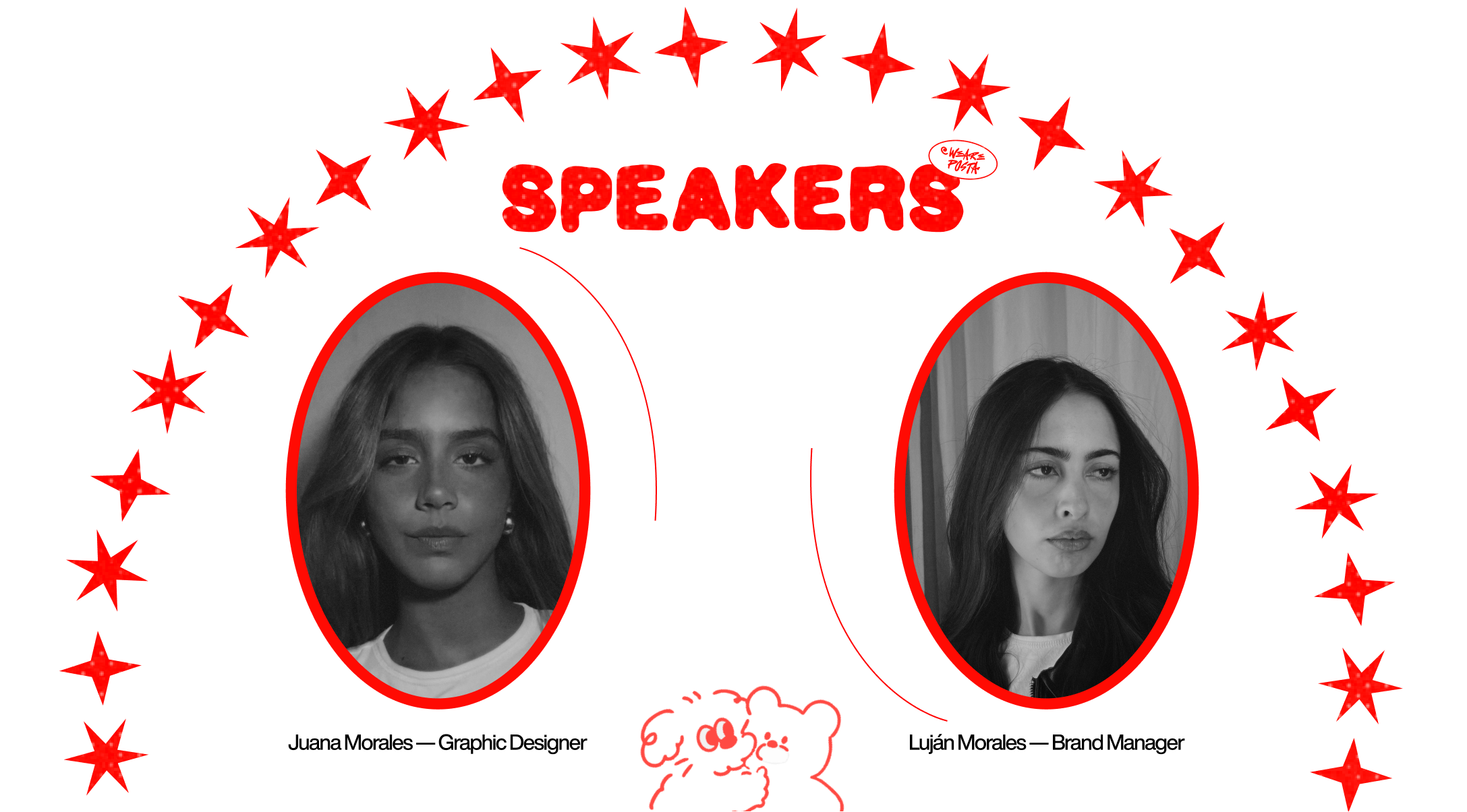
Who’s speaking: Luján & Juana, Posta Studio
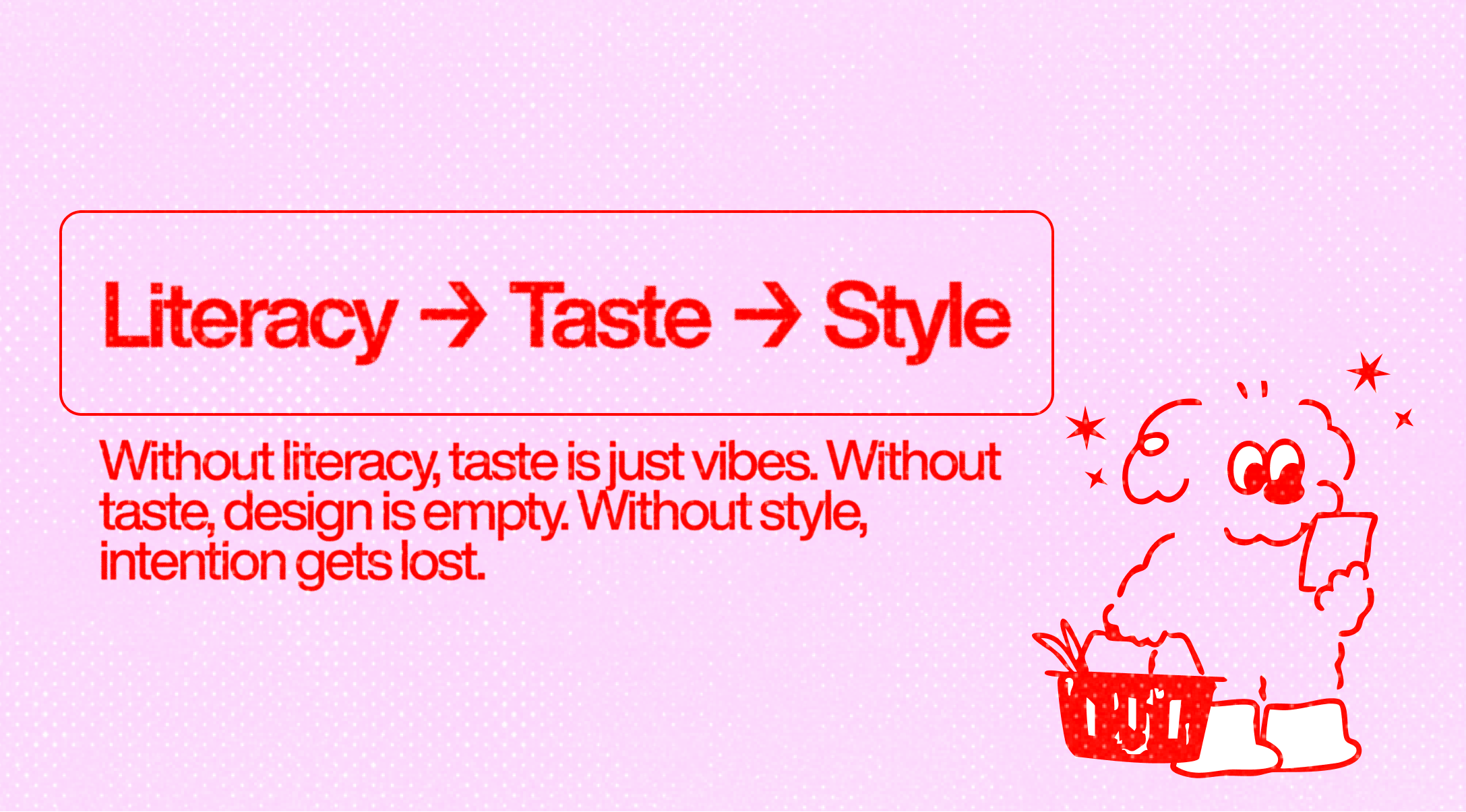
A framing we love: visual literacy → taste → style. Visual literacy is the grammar (composition, hierarchy, contrast, pacing). Taste is your inner filter — the calm yes/no that decides what stays. Style is the trail your decisions leave behind. In other words, literacy lets you understand, taste helps you choose, and style is how those choices show up.
Why this matters: if you’re missing literacy, your “taste” might just be vibes. If you skip taste, your work can be correct but soulless. And if you fixate only on style, you risk decoration over intention.
We’ve both had students send “questionable” references that, once unpacked, revealed something honest and useful. Trends age. Kerning sins are forever. But many labels (“good/bad”) shift with context: tools change, screens change, speeds change. What tends to hold up is integrity — choices that respect the user, time, and the brief. Trend-chasing ages overnight; technically perfect can still feel lifeless. “Durable” taste feels specific and oddly inevitable.
Our rule: don’t bully taste into consensus. Interrogate motive: Why this move, for this audience, right now?

Scrolling isn’t training. We force a micro-pause: Do I like this? Why? If we can’t answer, we still save it — then revisit a week later and see if it still holds. That tiny loop (notice → name → revisit) builds the filter.
We collect broadly (books, posters, motion, type specimens, architecture) and prune constantly. Moodboards aren’t decor; they’re thinking tools. If a reference moves the idea forward, it stays. If it’s just loud, it goes. Over time, that edit muscle gets fast, and your library becomes a compass instead of a cluttered drawer.
Some of our best taste calibrations come from non-design sources: street signage, bookbinding, a menu that nails spacing, even manhole covers (yes, really). Cross-disciplinary inputs diversify your “ear” for form, rhythm, and tone.
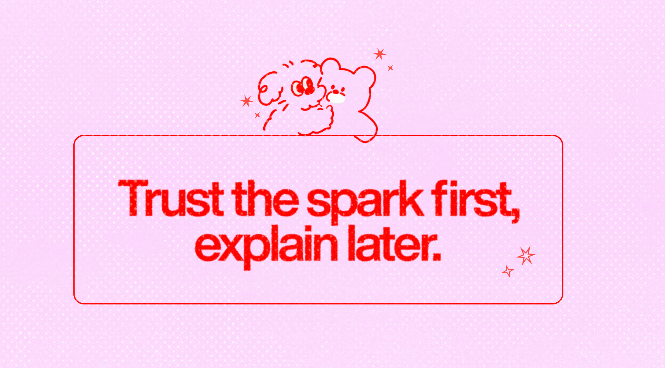
We don’t over-rationalize in the first 10 minutes. If something hits, it goes into the board. Later we articulate why. That sequencing protects the spark without abandoning rigor.
Taste becomes leadership when you translate it: “This type choice supports the reading rhythm,” “This level of restraint focuses the story,” “This composition reduces cognitive load.” We often show two viable paths with trade-offs and pair comps with short rationales. When people see the logic, what could sound like preference reads as stewardship. Also: our taste never outranks usability; sometimes the most tasteful move is simplifying.
Exercise 1 — The Side-By-Side
Pick two references that solve the same problem (e.g., event poster). List 5 differences in hierarchy, spacing, rhythm, and tension. Decide which better serves a stated goal (e.g., “late-night techno crowd”) and why.
Exercise 2 — The Seven-Day Board
Start a mini moodboard. Each day, add 3 references. On day 7, remove 10. Keep only items that pass Spark–Strength–Service. Repeat weekly.
Exercise 3 — Slow Looking 10
Spend 10 minutes on one piece. No phone. Note micro-decisions: column width, line-height, counter shapes, negative space, sequence of attention. You’ll start seeing why it feels right.
Exercise 4 — Copy → Diverge (Ethical Study)
Recreate a small layout to internalize its grammar. Then diverge on 3 axes (type system, grid, color). This isn’t portfolio work; it’s muscle memory for rhythm and proportion.
Exercise 5 — The Ratio Board
Constrain a board to: 40% timeless (books, wayfinding), 40% timely (current studios), 20% odd. That last 20% is your wildcard — the piece that breaks a rut.
Exercise 6 — Reverse Brief
Write the brief your favorite reference must have had. Then design a variant that would also satisfy it. You’re training the link between intent → form.
Exercise 7 — Taste Diary
Once a week, screenshot one thing you almost dismissed. Two weeks later, revisit. If it grew on you, ask why. You’ll spot your taste biases (and blind spots).
We show references early, with reasons. We ask clients to react to function (“Which hierarchy gets you to the CTA faster?”) before style. We present two honest routes and their trade-offs. And when feedback is vague (“make it pop”), we translate it into parameters (contrast, scale, density) and test those variables instead of chasing noise. This is how taste stops being “personal preference” and becomes a shared decision system.
It looks like choosing a type family that lets the story breathe, not perform. It looks like killing that third flourish because the page already sings. It looks like trusting one decisive color move instead of five timid ones. It looks like removing the clever bit you love because it steals attention from the message.
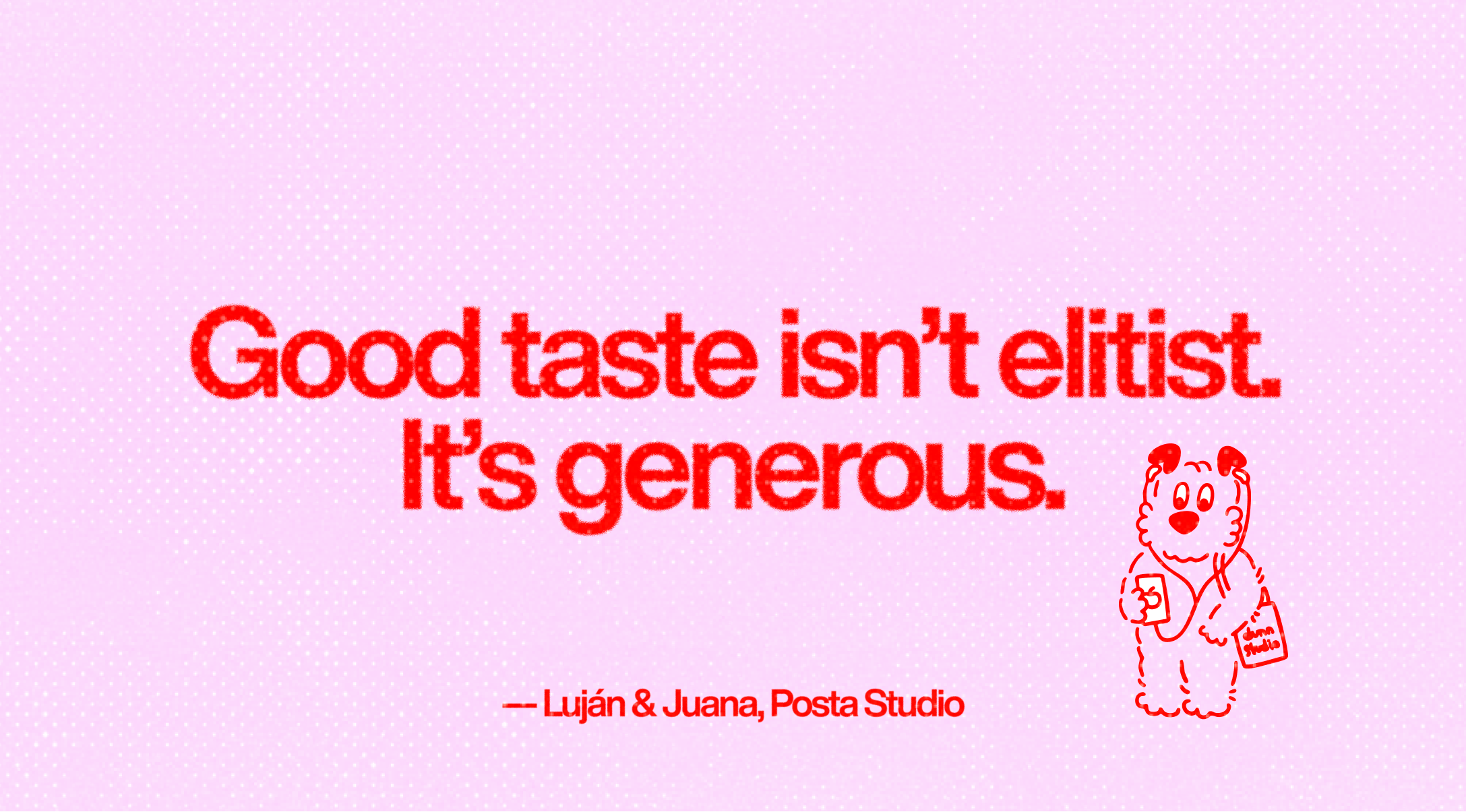
It’s not elitist. It’s generous — clarity is kindness. And the better your taste gets, the kinder your design becomes.
Stay curious, stay editing, stay explaining. Your voice will get clearer. Your decisions will get faster. And your work will feel less like decoration and more like inevitable the kind of design people remember without quite knowing why.


Book a demo and see if this is the best solution for your startup!
Hola, se habla español


