.png)


Posta Studio is currently contributing 1% of its revenue
to fund carbon removal.

%2012.14.10%E2%80%AFp.%C2%A0m..png)
About a month ago, we got the chance to work on a new branding project, an Argentinian café concept for New York. It was one of those briefs that immediately felt exciting: cultural, expressive, and full of creative potential.
While running our first workshop, we realized it was the perfect opportunity to share our full design process.
We talk a lot about how we build brands, but this time we wanted to show the behind-the-scenes: the decisions, the conversations, and the early thinking that shapes everything that comes after.
Our process moves through five stages: Brand Concept & Analysis, Moodboarding, Naming Exploration, Branding Exploration, and Refinement & Handoff.
We’ll be sharing each one along the way.
So this post kicks off Stage 1: Brand Concept & Analysis, the foundation of every brand we create at Posta Studio.
To make it real, we’re using this café sprint as our example. Everything here comes directly from the workshop we ran a few weeks ago.
Before designing anything, we like to look ahead. It helps us understand the potential shape of the brand over time.
This café’s long-term picture started something like this:
A first location in the Lower East Side.
Warm, modern, creative.
Subtle Argentine gestures without falling into clichés.
Handwritten menus, imperfect ceramics, playlists curated by friends.
A small expansion: Brooklyn, Paris, Tokyo.
Collaborations with designers, chefs, and artists.
Ceramics, merch, small-batch food items.
A recognizable cultural spot, a place where people expect good taste, good energy, and good company.
A creative ecosystem with events, workshops, small exhibitions, and a sense of community rooted in both New York and Buenos Aires.
Exploring these possibilities helps us shape decisions that feel consistent as the brand evolves.

We reinterpreted the Golden Circle in a way that feels natural to our process.
It’s a simple way to capture the emotional core before visuals exist.
Because cafés are cultural spaces, not just functional ones, and Buenos Aires has a way of turning everyday moments into something warmer and more human.
Through a mix of honesty, ease, and quiet confidence.
Warm gestures, approachable details, and a blend of editorial and everyday elements.
A café that brings people together.
Good coffee, good pastries, and an atmosphere that feels familiar from day one.
This step gives us the starting point for the brand’s tone and attitude.
Values guide decisions, big and small.
They help maintain consistency when the brand starts expanding into visuals, messaging, and experience.
From the café sprint, three values stood out:
Details that feel honest and imperfect in a good way.
Taste over trends.
Moments of conversation, long mornings, shared rituals.
Textures, light, materials design that feels lived-in rather than polished.
Instead of fiction or demographic boxes, we focus on how people naturally use a space.
During the café sprint, three kinds of visitors appeared clearly:
Someone who spends a slow morning with a laptop, book, or sketchpad.
They look for calm corners, natural light, and a relaxed environment.
People who want high-quality pastries and coffee but take them with them.
They appreciate speed, friendliness, and clarity.
Friends who meet up for late mornings, long conversations, or a weekly catch-up.
For them, the atmosphere is as important as the menu.
Understanding these behaviors shapes the rhythm and layout of the brand.
This step helps us understand how the brand “carries itself.”
For the café, the personality landed somewhere modern and warm; expressive in small ways, without overwhelming.
Familiar, but not nostalgic.
These notes guide the editorial tone, the visual mood, and the overall attitude the brand projects.
We take a look at the brands that share a similar universe, their tone, and their aesthetic approach. It gives context and helps us define the direction the brand will grow into.
For this café, the landscape included places like Cortado Paris, Dimes NYC, and Blue Bottle. Each has its own strengths, and seeing them together helped position this concept naturally:
a blend of editorial warmth, Argentine casualness, and modern New York energy.
This sets a solid foundation for the visual phase.
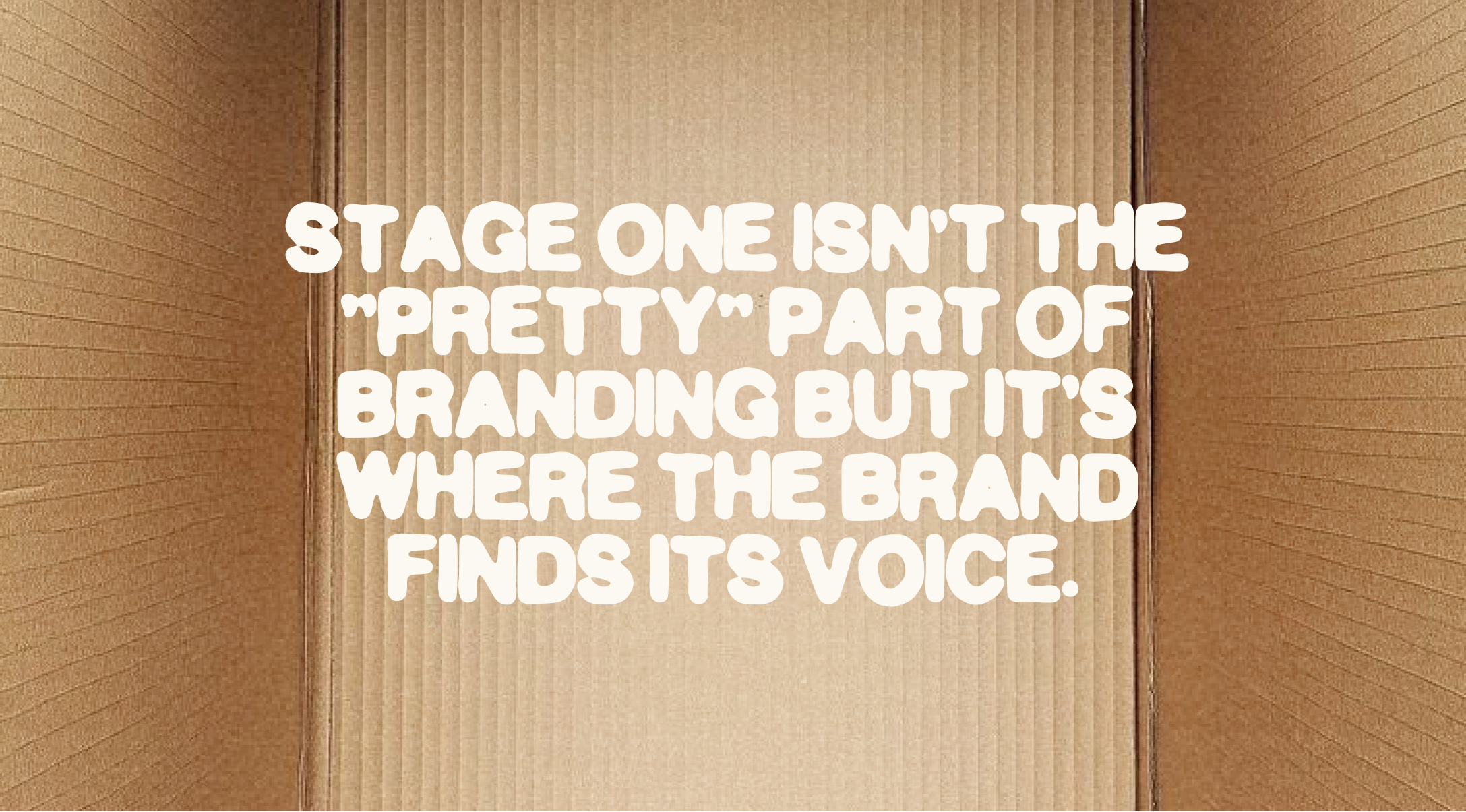
Stage 1 isn’t the “pretty” part of branding but it’s where the brand finds its voice.
When these foundations are clear, the next stages feel intuitive: moodboards, naming, visual explorations, and the full identity.
This café project is now moving into Stage 2, and we’ll be sharing that process as well.
Stage 2 drops next week.


Book a demo and see if this is the best solution for your startup!
Hola, se habla español


