.png)


Posta Studio is currently contributing 1% of its revenue
to fund carbon removal.

%201.02.18%E2%80%AFp.%C2%A0m..png)
After defining the brand concept in Stage 1, the next step was to bring the idea into a visual space.
Moodboards are where the project first gains atmosphere, not final, not polished, but alive enough to react to.
For this café project, we built three visual directions to explore how an Argentinian spirit could live inside a New York context.

Each board pulled from different references: photography, typography, illustration, printed ephemera, textures, color palettes, and cultural gestures.
During the workshop, we reviewed each board with the client, collecting reactions that helped refine where the brand needed to move. Some notes they left were:
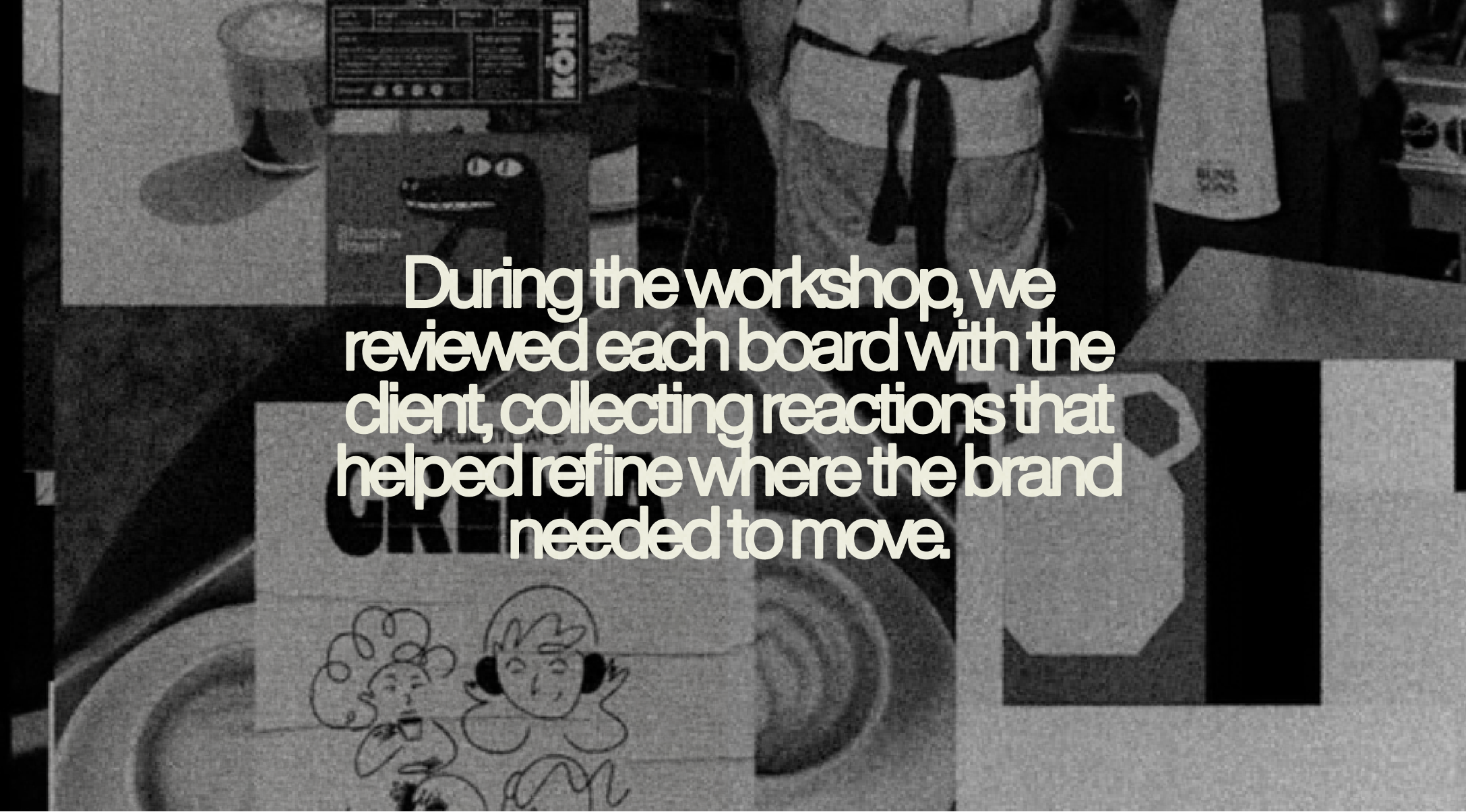
These comments guided us toward the emotional core of the brand.
Some directions leaned urban and expressive, others warm and intimate, others nostalgic in a subtle, shared way between BA and NYC.
Moodboards help us define early:
• What emotion the brand should carry
• How the space should feel
• What visual language matches the personality
• And just as important what the brand should not look like
By seeing the three boards together, plus the client feedback annotated across each one, we realized a common thread:
the brand needed warmth, humanity, and that unmistakable Argentinian instinct of making something great with very little.
That became our north star going into naming.
💬 If you want to see the early sketches, workshop notes, and client annotations, you can find them in the Instagram post linked in the article.
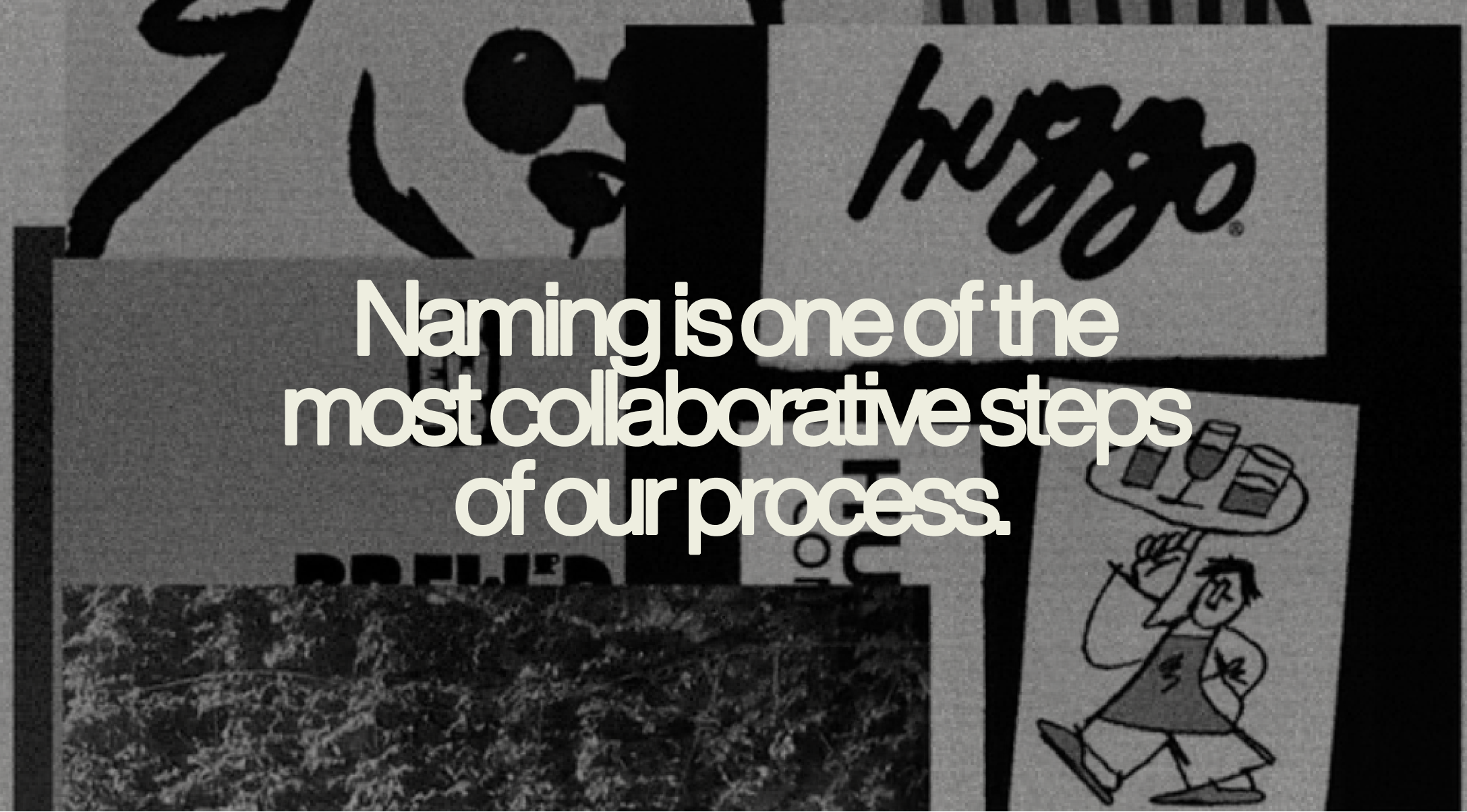
Once the visual territories were clear, we moved into naming.
Naming is one of the most collaborative steps of our process. For this stage, we worked closely with the client: we shared directions, gathered reactions, refined the list, and watched strong ideas emerge naturally.
To evaluate each name, we look at three pillars:
For this café, we explored short, playful, culturally-rooted words from everyday Argentine language, without falling into stereotypes. Names that feel familiar to us, but fresh in a New York setting.
Some names carried warmth (Miga, Crema).
Others carried energy (Tuki, Bicho).
Others captured a sense of place (El Patio, Orilla).
As we presented them, the client left feedback directly on the board:
By the end of the session, two names stood out as clear favorites for everyone in the room: El Patio and Crema.
They each opened a different world, one more about place and community, the other more about product and that “best part of the coffee” feeling.
Instead of forcing a decision in the workshop, we parked both options and carried them into the next stage, to see how they behaved once we started designing around them.
With visuals (Stage 2) and naming directions (Stage 3) aligned, we’re ready to move into Branding Exploration, where we test how each name lives as a full identity: logo, typography, color, applications, and overall system.
In the next article, we’ll share those explorations and reveal which name became the final choice for the brand, and how the identity grew from there!


Book a demo and see if this is the best solution for your startup!
Hola, se habla español


